OBJECTIVE
Create a modern, easy-to-navigate website that highlighted Sunco Construction’s expertise in residential and commercial construction.
SCOPE: User Experience Design, UX Research, Information Architecture, Copywriting, UI Design, Web Development, SEO
OUTCOME
With a user-centered design and clear structure, Sunco is now equipped to make a powerful digital impression that reflects their commitment to quality and innovation.
Sunco Construction’s new website successfully captures the quality and breadth of their construction work, presenting a modern, cohesive image to prospective clients. Within the first 30 days post-launch, the site attracted 414 visits and 375 unique users, with high engagement across services and portfolio sections.
Overview
Our team’s goal was to create a modern, easy-to-navigate website that highlighted Sunco Construction’s expertise in residential and commercial construction. The previous website was outdated, impacting both load times and usability, and did not effectively showcase the high-quality work Sunco wanted to emphasize.
Initial Research
Our team began by conducting in-depth interviews with Sunco’s leadership and core office members to gather insights into their goals, user feedback, and redesign ideas. Sunco’s main objectives were to:
Simplify navigation and improve usability.
Modernize the visual aesthetic to reflect the quality of their construction projects.
Highlight their commercial and residential portfolios in an accessible and appealing way.
Customer Feedback Analysis: We also analyzed feedback from Sunco’s clients, who noted challenges with site navigation, a desire for more detailed project portfolios, and a need for easy access to contact options.
Card Sorting Exercise: Based on these insights, we conducted a card sorting exercise to organize the site’s content in a way that met both user and business needs. This collaborative activity helped us finalize a clear and effective navigation structure.
Information Architecture
The finalized site architecture included four primary tabs, strategically organized to streamline user navigation:
About: Consolidated company information, allowing easy access to Sunco’s history and team details.
Services: Divided into “Commercial” and “Residential” categories to clearly represent Sunco’s service offerings.
Portfolio: A dedicated section to showcase completed projects, highlighting Sunco’s work quality and variety.
Contact: Multiple contact options segmented by need, making it easy for users to reach the appropriate team.
This structure balanced usability and information accessibility, providing a cohesive experience for Sunco’s diverse audience.
Wireframes and Prototype Designs
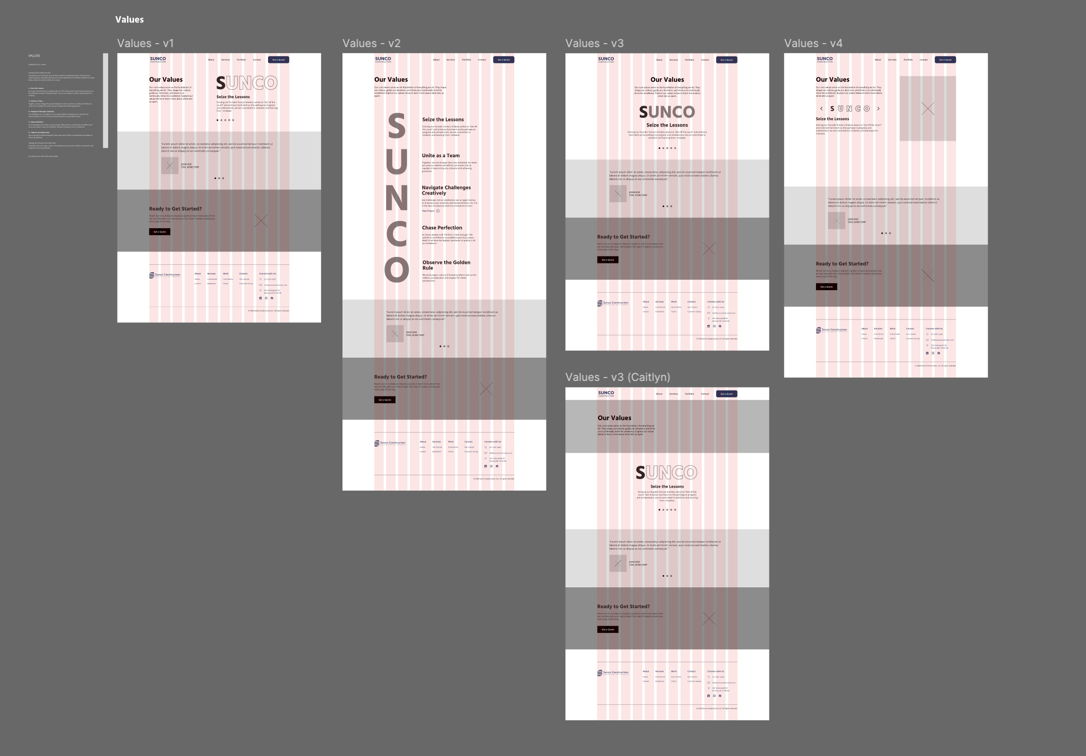
After approving the site architecture, our team developed low-fidelity wireframes to outline each page’s layout and content flow, focusing on usability and accessibility. These wireframes were then handed to a web designer, who integrated Sunco’s branding elements to create a cohesive visual design.
Interactive Prototype: We created an interactive Figma prototype, allowing Sunco’s team to preview the user flow and offer feedback before development. This collaborative approach ensured alignment on user experience and brand aesthetics.
Website Development
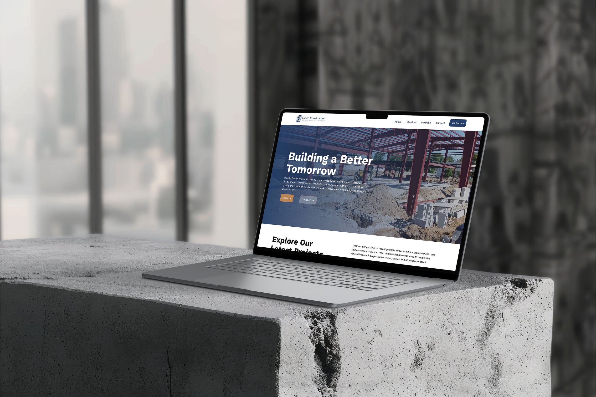
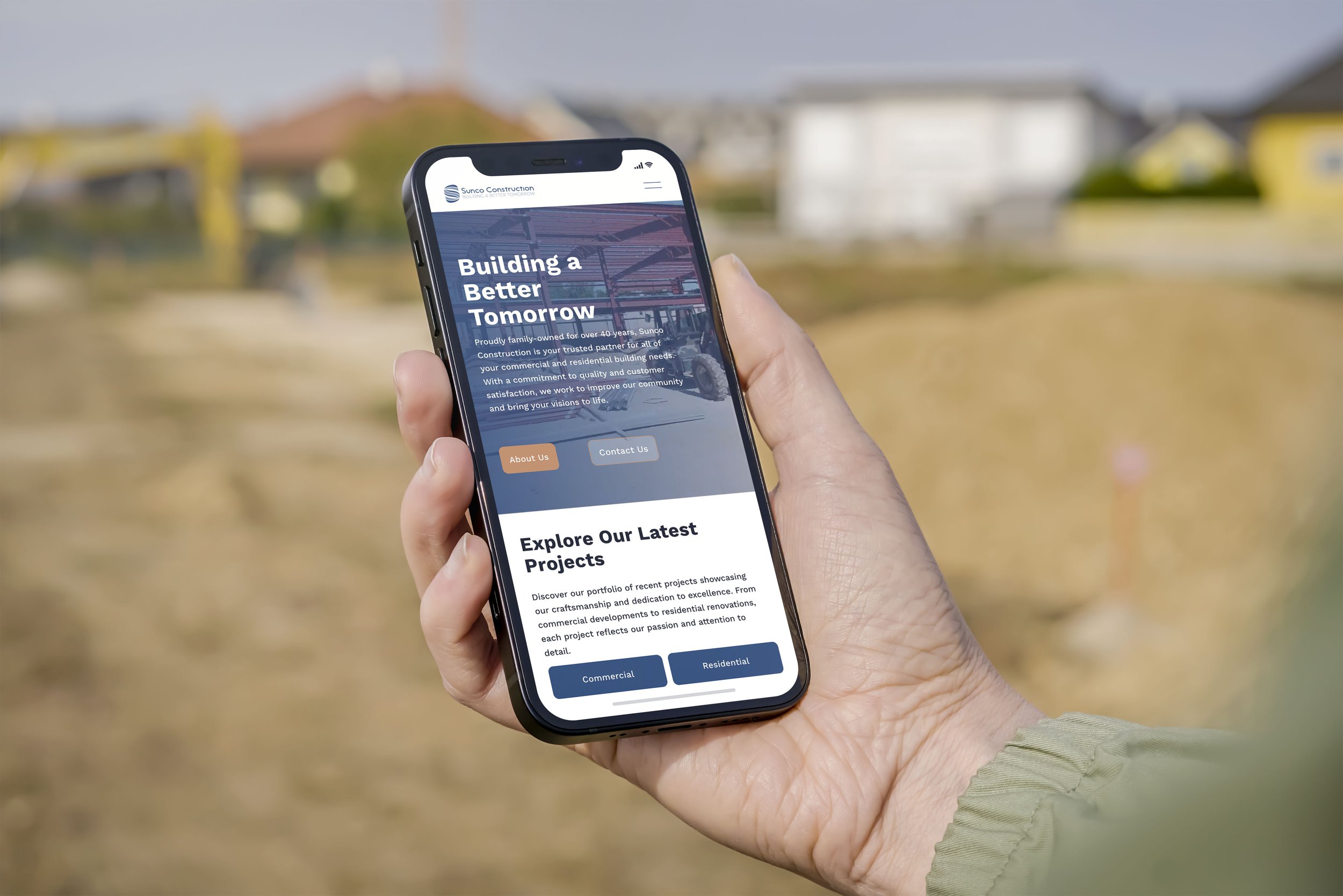
We selected Squarespace for the website build, offering Sunco an easy-to-maintain platform for future updates. Squarespace’s responsive design capabilities optimized the site for both desktop and mobile users, ensuring a seamless experience across devices.
Load Time Optimization: Our team prioritized load times to ensure the site performed efficiently, bringing the interactive prototype to life with a focus on cross-device compatibility.
Post-Launch Analysis
In the first 30 days post-launch, we closely monitored key metrics to assess the new website’s impact on engagement and visibility:
414 Website Visits and 375 Unique Visitors: The high volume of unique visitors indicated the site’s appeal and improved usability, attracting new users.
252 Direct Visits: Many users accessed the site directly by typing in the URL, reflecting strong brand recognition and intentional searches.
159 Visits from Search Results: Initial SEO efforts led to increased organic traffic, with users finding Sunco’s site through relevant search terms.
127 Button Clicks: High engagement with the site was reflected in the significant number of button clicks, showing users actively explored content, services, and the portfolio.
Top Keywords: The majority of search traffic stemmed from direct searches for “Sunco” and “Sunco Construction,” with additional clicks from community-related keywords like “Citizens Bank” and “Mooresville Schools.”
These early metrics demonstrated that the redesign not only enhanced user engagement but also improved visibility for prospective clients. The responsive, user-centered design successfully positioned Sunco Construction for a stronger digital presence and greater community reach.
“Absolutely would recommend Absorb to others. The quality of services provided was amazing. In addition, the response times were better than expected in answering any questions or needing anything from them.”
Jason Wolfe
Pre-Construction Manager at Sunco Construction


