

Using UX Reading Patterns to Boost Engagement on Your Website
First things first, what are UX reading patterns?
UX reading patterns are the ways in which people scan and read content on a website or app. By understanding these patterns, designers and content creators can optimize their content to better engage users and provide a more enjoyable experience.
The Z-shaped reading pattern.
So, let's dive into the first pattern: the Z pattern.
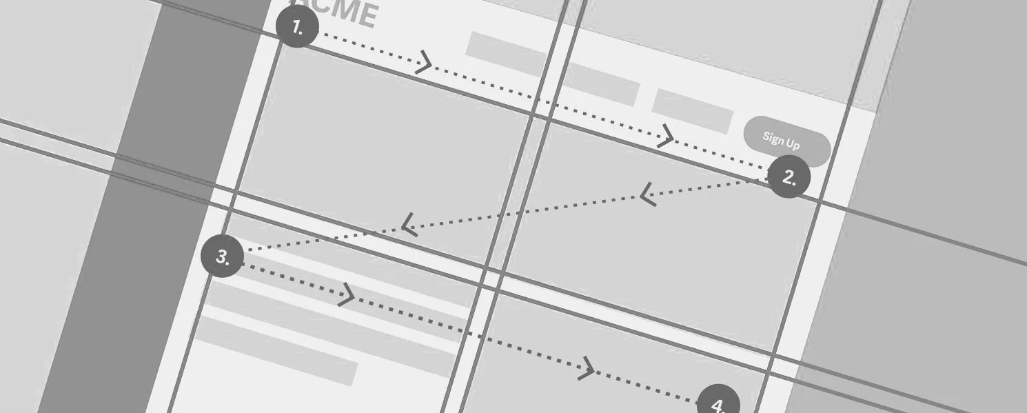
The Z pattern is based on the idea that most users will start at the top left corner of a webpage and scan across to the right. They will then move down the page and scan across again in a diagonal line, forming a "Z" shape. This pattern is most commonly used on landing pages, as it allows for important information to be displayed prominently at the top of the page, with supporting content placed lower down.
For example, imagine you're looking at a webpage for a new restaurant. The top of the page might display the restaurant's name, logo, and a hero image of the interior. As you scan across to the right, you might see a call-to-action (CTA) button encouraging you to make a reservation. As you move down the page, you'll see reviews from happy customers, a menu, and finally, a footer with contact information.
The F-shaped reading pattern.
Next up, we have the F pattern.
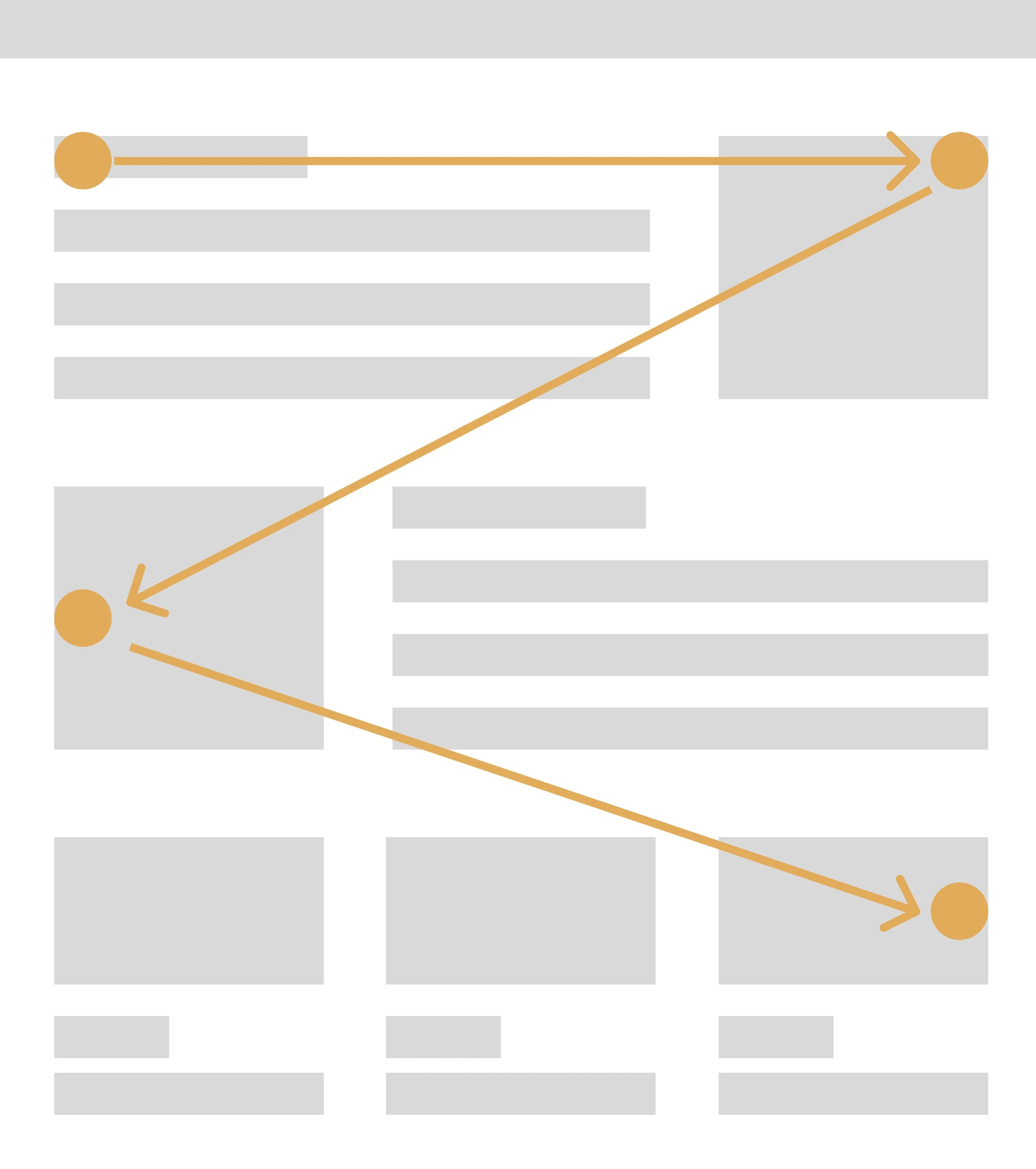
The F pattern is based on the idea that users tend to read in an "F" shape. They will start at the top left of a webpage and scan across to the right, just like in the Z pattern. However, instead of moving down in a diagonal line, they will scan back across the page in a shorter horizontal line. This creates the top bar of the "F". Users will then repeat this process, scanning down the page and forming the longer vertical line of the "F".
This pattern is most commonly used on content-heavy pages, such as news articles or blog posts. By placing important information and headings along the top of the page, designers can ensure that users will see them. As users scan down the page, they will quickly skim through the content, focusing on bolded headings and bullet points.

The layer-cake reading pattern.
Moving on to the layer-cake pattern.
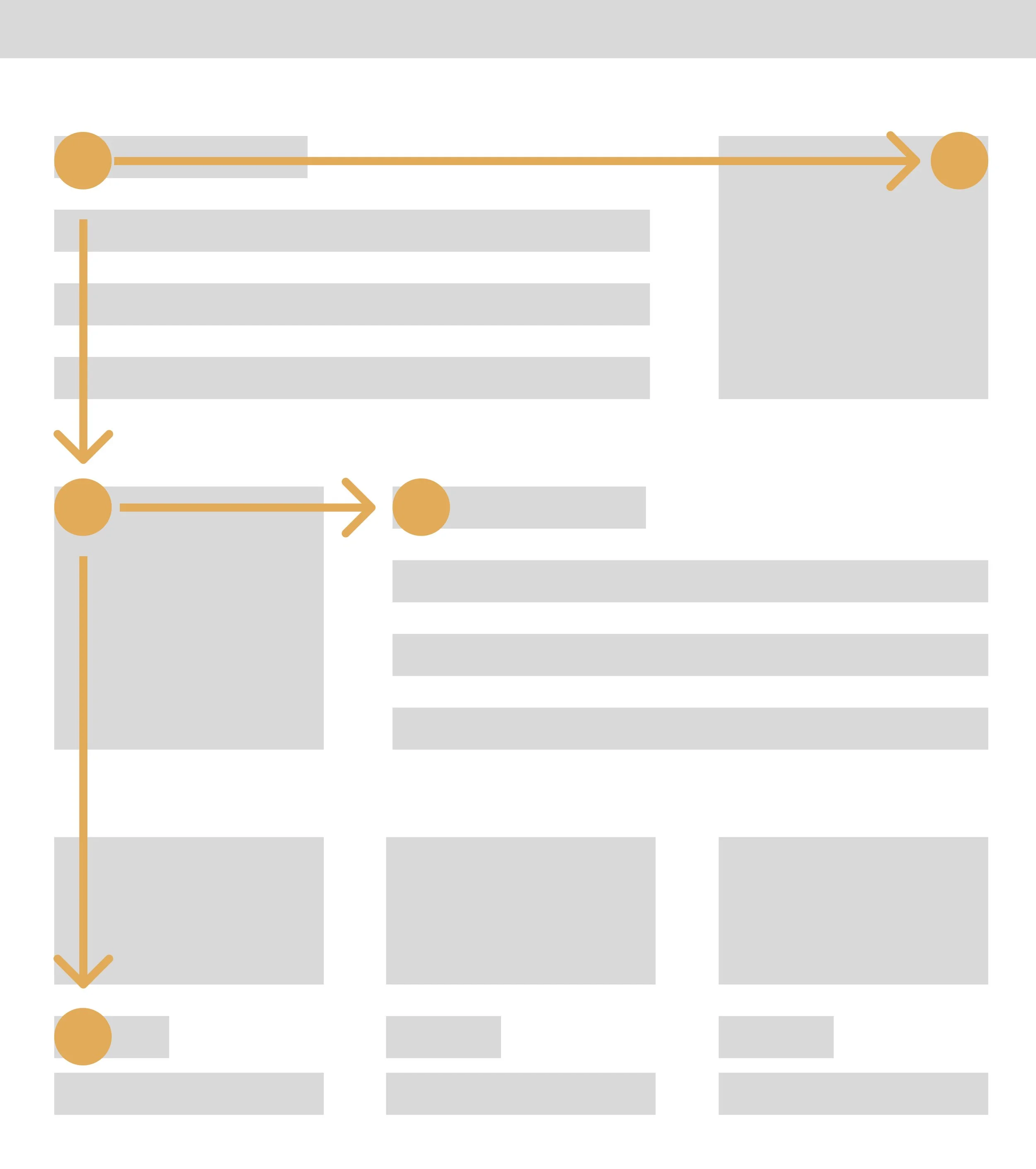
The layer-cake pattern is based on the idea that users tend to scan through layers of information, like the layers of a cake. They will start at the top of a webpage and look for headings or other prominent information that catches their eye. From there, they will scan through the layer of information beneath it, and then the layer beneath that, and so on.
This pattern is most commonly used on pages that have a lot of information to convey, such as product pages or service descriptions. By breaking the content up into smaller, more digestible sections with clear headings, users are more likely to engage with the content and absorb the information

The commitment pattern.
And finally, we have the commitment pattern.
The commitment pattern is based on the idea that users tend to commit to reading once they've made a decision to do so. This means that if users see a heading or sentence that piques their interest, they're more likely to commit to reading the rest of the content.
This pattern is most commonly used on pages that require a lot of user engagement, such as registration pages or checkout processes. By placing enticing headings and CTAs throughout the page, designers can encourage users to commit to reading the entire page and completing the desired action.
How to use reading patterns
Now that we've explored these patterns, you might be wondering how to use them effectively in your own design work. First, it's important to understand your audience and what kind of content they're looking for. If you're designing a landing page for a restaurant, for example, you'll want to use the Z pattern to ensure that users see the most important information first. On the other hand, if you're designing a blog post, the F pattern might be more effective in getting users to engage with the content.
Once you've chosen a pattern, make sure to prioritize the most important information. This means placing it in the areas where users are most likely to look, such as the top of the page or the beginning of a section. Use headings, bolded text, and other visual cues to guide users through the content and highlight the most important points.
Finally, make sure to test your design with real users to see how effective it is. A/B testing can help you compare different design variations and see which one works best for your audience. Use analytics tools to track how users interact with your content and make adjustments as needed.
Understanding UX reading patterns is a key component of creating effective designs.
By using these patterns to guide your content layout and placement, you can create a more engaging and enjoyable user experience. Whether you're designing a landing page, blog post, or product page, keep these patterns in mind to ensure that your content is both informative and visually appealing. Happy designing!