OBJECTIVE
Redesign the Peace Restored website to create a safe, accessible, and intuitive space where women facing traumatic life experiences can find support and resources.
SCOPE: User Experience Design, UX Research, Information Architecture, Copywriting, UI Design, Web Development, SEO
OUTCOME
Peace Restored’s redesigned website now offers a safe, accessible, and empathetic space for women seeking support.
The trauma-informed design and user-friendly architecture make it easier for clients and donors to find critical information, contributing to the organization’s mission. Within six months, the site saw a 29% increase in visits and a 45% rise in page views, demonstrating higher engagement and visibility. Equipped with streamlined navigation, a Quick Exit safety feature, and a refreshed digital presence, Peace Restored is now better positioned to reach and support its community.
Overview
Our team was tasked with redesigning the Peace Restored website to create a safe, accessible, and intuitive space where women facing traumatic life experiences can find support and resources. The original website didn’t effectively address the needs of its audience—women navigating sensitive situations like abuse, grief, or depression. Our objective was to develop a trauma-informed design that prioritized ease of navigation, quick access to resources, and critical safety features, such as a discreet exit button.
Initial Research
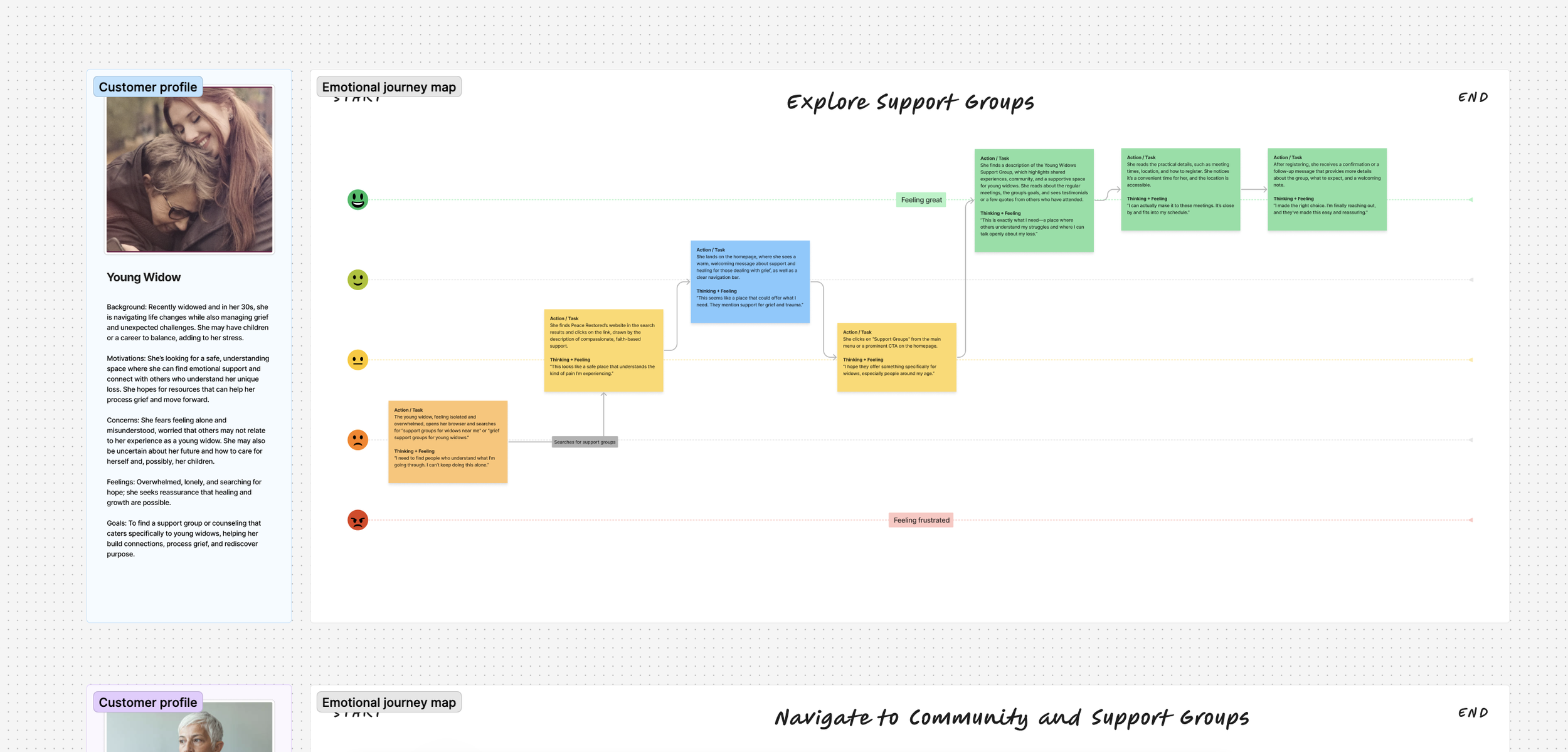
Our team evaluated the existing website to pinpoint usability issues and areas needing improved content organization for a more empathetic user experience. We developed specific personas to represent key client types, including:
A young widow seeking emotional support.
An elderly widow dealing with isolation and grief.
A middle-aged woman experiencing domestic violence, needing secure access to resources.
A middle-aged woman with trauma from past experiences, looking for counseling and healing resources.
A middle-aged woman seeking community support groups for ongoing mental health challenges.
These personas guided our design approach, ensuring that the website would meet the unique needs of each user group.
Empathy & Journey Mapping
To build a trauma-informed and accessible design, we began with an in-depth empathy mapping process, conducting interviews with real users to understand their specific needs and emotional states. By incorporating insights from these interviews, we identified key improvements to create a safe and supportive online space.
Key Persona Insights:
Safety Concerns: Many users in abusive or dangerous situations require discretion. This insight led to the development of a “Quick Exit” button, enabling users to leave the site instantly without attracting attention.
Information Access: Users emphasized the need for straightforward navigation to access resources quickly, particularly urgent ones like counseling and support groups.
Dual Functionality: Interviews revealed that Peace Restored also serves donors and supporters, who needed quick access to information about the organization’s mission, goals, and ways to contribute. A secondary navigation path was integrated to meet this need.
These findings shaped the core of our redesign, balancing sensitive access for clients with informative pathways for donors.
To refine the user experience further, we developed journey maps for each persona, visualizing the steps and emotions each user might experience on the website. Given the sensitive nature of Peace Restored’s services, journey mapping allowed us to identify potential pain points, moments of hesitation, and critical needs during each user’s interaction with the site.
Information Architecture
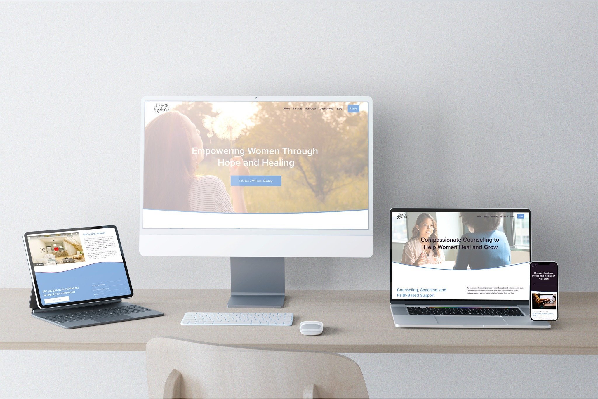
To create a user-friendly structure that served both clients and secondary audiences (e.g., grant committees, volunteers, and donors), we developed an intuitive information architecture. After careful consideration of user needs, we structured the main navigation into five clearly labeled sections:
About: Peace Restored’s mission, vision, and team information to build trust with new visitors.
Services: A dedicated section outlining Peace Restored’s support services for women facing trauma.
Resources: Educational materials and tools supporting mental health and wellness.
Get Involved: Opportunities for supporters to volunteer, donate, or participate in events.
Donate: A direct link for quick donations, making financial support accessible to visitors.
The navigation successfully balanced the needs of all user groups, enhancing Peace Restored’s professional and organized digital presence.
Footer and Additional Links: The website footer included essential contact information and links to secondary pages, as well as a sitemap for internal use, allowing Peace Restored staff to maintain and update content easily.
Quick Exit Button: Given the sensitivity of the user base, we integrated a floating “Quick Exit” button, ensuring that users in need of a quick escape could find it easily. The button instantly closes the Peace Restored website and redirects the user to a neutral page, prioritizing user safety.
Design and Development
We chose Squarespace as the platform for its user-friendly interface, making it simple for the Peace Restored team to manage content updates. This platform also allowed us to maintain a cohesive visual style with minimal technical oversight.
Visual Design: To convey a sense of calm and hope, we selected a light, uplifting color palette with vibrant accents. Airy, colorful photography added visual appeal, reinforcing the welcoming atmosphere of the site.
Typography and Visual Hierarchy: With sensitivity to the nature of the content, we used a strong visual hierarchy to create engaging headlines and concise descriptive text. This approach ensured that key information was accessible without overwhelming users.
Development and Responsiveness: Squarespace’s responsive design options allowed us to create a seamless experience across devices. We optimized load times and minimized distractions to keep the user experience smooth, aligning with Peace Restored’s mission.
Accessibility and Safety: We incorporated accessibility features to meet WCAG compliance standards and embedded the Quick Exit button to support users in vulnerable situations.
Post-Launch Analysis
Following the launch, we monitored performance metrics at 30, 60, and 90 days, as well as a 6-month milestone, to assess the impact of our design and SEO improvements.
Results at the 6-Month Mark:
810 Website Visits (+29%): Increased interest and accessibility for users seeking support or information.
602 Unique Visitors (+4%): The website reached a broader audience, reflecting its new appeal.
1.5K Page Views (+45%): Improved navigation encouraged users to explore additional resources.
66% Bounce Rate (stable): Users engaged with the site without leaving immediately.
97 Clicks from Search Engines (+39%): Improved SEO drove a substantial increase in organic search traffic.
3.3K Impressions from Search Engines: Increased visibility raised awareness of Peace Restored’s services.
2.98% Click-Through Rate (+75%): The CTR increase indicated the site’s appeal in search results.
“Absorb is an awesome company to work with to produce a beautiful end product. We have enjoyed having them as our partners for several years. If you are looking for a company to help you convey your company's vision this is the place to be.”
Ann Madison
Executive Director of Peace Restored


