OBJECTIVE
Give the Center Grove Church website a facelift to more clearly convey their values and share more information about their ministry in a more approachable, and reputable way.
SCOPE: Information architecture, Content revisions, Copywriting, UI design, UX design, Website best practices training, Video production, Photography
OUTCOME
The redesign and launch of the Center Grove Church website were a huge success and helped to establish the church's online presence and visibility.
After launching the new website, we saw a significant increase in traffic. The website went from 1-8 visitors per day to 19-30 per day after launch, with minimal SEO efforts and no paid marketing.
In conclusion, by following a rigorous process that involved close collaboration with stakeholders, evaluation of user data, and establishment of a consistent visual style, we were able to create a website that not only looks great but also serves its intended purpose effectively. The successful launch of the website and increased traffic reflects the commitment of our team to delivering top-quality results.

Process
Establishing a team and evaluating the old website
The first step in the process was to establish a team that would be responsible for the website's redesign. We assembled a team consisting of a strategist, copywriter, and UX designer to ensure that every aspect of the website redesign would be handled by a dedicated expert.
We evaluated the old website and identified key information that should be included on the new website. We also analyzed the website's traffic data to determine what pages were most visited and what content was most engaging to users. This data helped us to identify areas that needed improvement and areas that could be enhanced.
We worked closely with the internal team and key stakeholders to ensure that their vision would be translated well on the new website. We held several meetings and presentations to gather their input and feedback, ensuring that their needs were met while also adhering to best practices in web design.

Creating a rough draft version of the website
Before establishing the new visual style, we created a med-fi rough draft version of the website to get the main architecture in place. This helped us to ensure that the website's structure and navigation would be user-friendly and intuitive.
We then worked with the internal team to establish a new visual style with light, airy, and enriching visuals. We used images and colors that conveyed a sense of calm and serenity, reflecting the church's values and beliefs. The visuals also helped to make the website more engaging and inviting for visitors.
Hand-off and launch
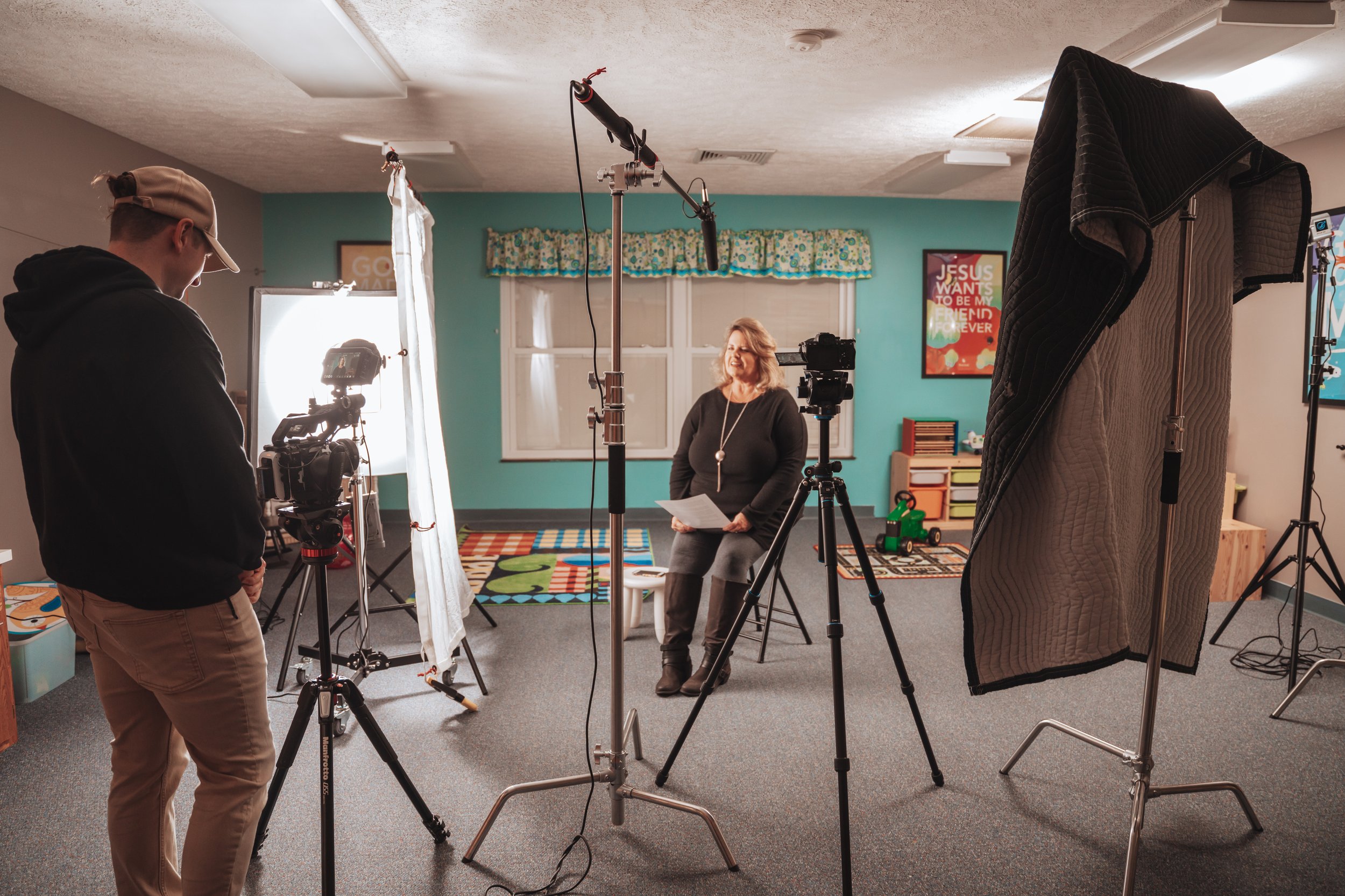
We created a best practices guide for delivery and hand-off, ensuring that the website's maintenance and updates would be as easy and efficient as possible. We also worked with the Productions team to generate videos to add more visual interest and support SEO measures across the website. We identified areas that would benefit the most from videos and worked with the internal team to revise their scripts and establish a visual style that would positively impact their audience.
Cinematography
Identifying areas for videos
The Absorb Productions and Absorb Experience teams collaborated to identify areas of the website that would benefit from a video. The main goal of this collaboration was to increase the website's SEO efforts and provide a better user experience. The Absorb Experience team identified several pages that held a lot of copy and were very dense to read, which made it difficult for users to retain information. We believed that adding videos to these pages would help increase engagement and improve the user experience overall.
Absorb Productions created a total of 5 videos to be hosted on the website. These videos were created to provide additional information about the products and services offered by Absorb Productions. The team also created a banner video that would play on the homepage to introduce the brand and its offerings.
Launching the videos
The addition of videos to the website not only made the content more engaging but also helped to increase SEO efforts. The videos helped to decrease bounce rates and increased the average time users spent on the website.
The banner video that was created for the homepage received a lot of positive feedback and helped to increase brand recognition. The videos that were created for the individual pages also helped to provide users with a better understanding of the values and services offered by the Center Grove Church ministry.


